Monochromatic Quilts
by Stephanie Adams (@cottoncommotion)
This month’s quilty challenge is monochromatic quilts. I love making monochromatic quilts because it lets me dive deep into a color, bust my stash, and raid my scraps. Honestly, I’m often overwhelmed by incorporating multiple colors and working from one hue can simplify things. One benefit of monochromatic quilts is it is MUCH easier to decide what color thread to use for quilting.
-

Monochromes
Monochromatic means that all of the colors are derived from a single hue. As you can see from the image above from The Quilter’s Field Guide to Color by Rachel Hauser, there is quite a bit of variety within a hue as you vary the (1) value - lightness/darkness; (2) shade - adding black; (3) tone - adding gray; (4) tint - adding white; and (5) saturation - intensity of hue.
-

Hues
It can be hard to correctly identify the hue particularly when there’s a lot of shade, tone and tint involved. Some of those pinks look more like purples or reds to me. With that in mind, I say go with “monocheatmatic” if it makes you happy. Above is an orange “monocheatmatic” quilt that I’m working on . . . if I could see any orange in the color, its orange.
-

Tips on Fabric Pulls
Ombre/Gradient - Ombre quilts are quite the rage and they can be beautiful. Looking at the pink hue image above, imagine starting with the pure pink hue and working down one side of the pyramid or the other. I’m not sure I nailed the hue perfectly but I tried log cabins with the same five Kona colors in 3 layouts and each looks beautiful.The Kona colors from dark to light are Midnight, Purple, Bright Periwinkle, Lavender and Princess.
-

Tips on Fabric Pulls 2
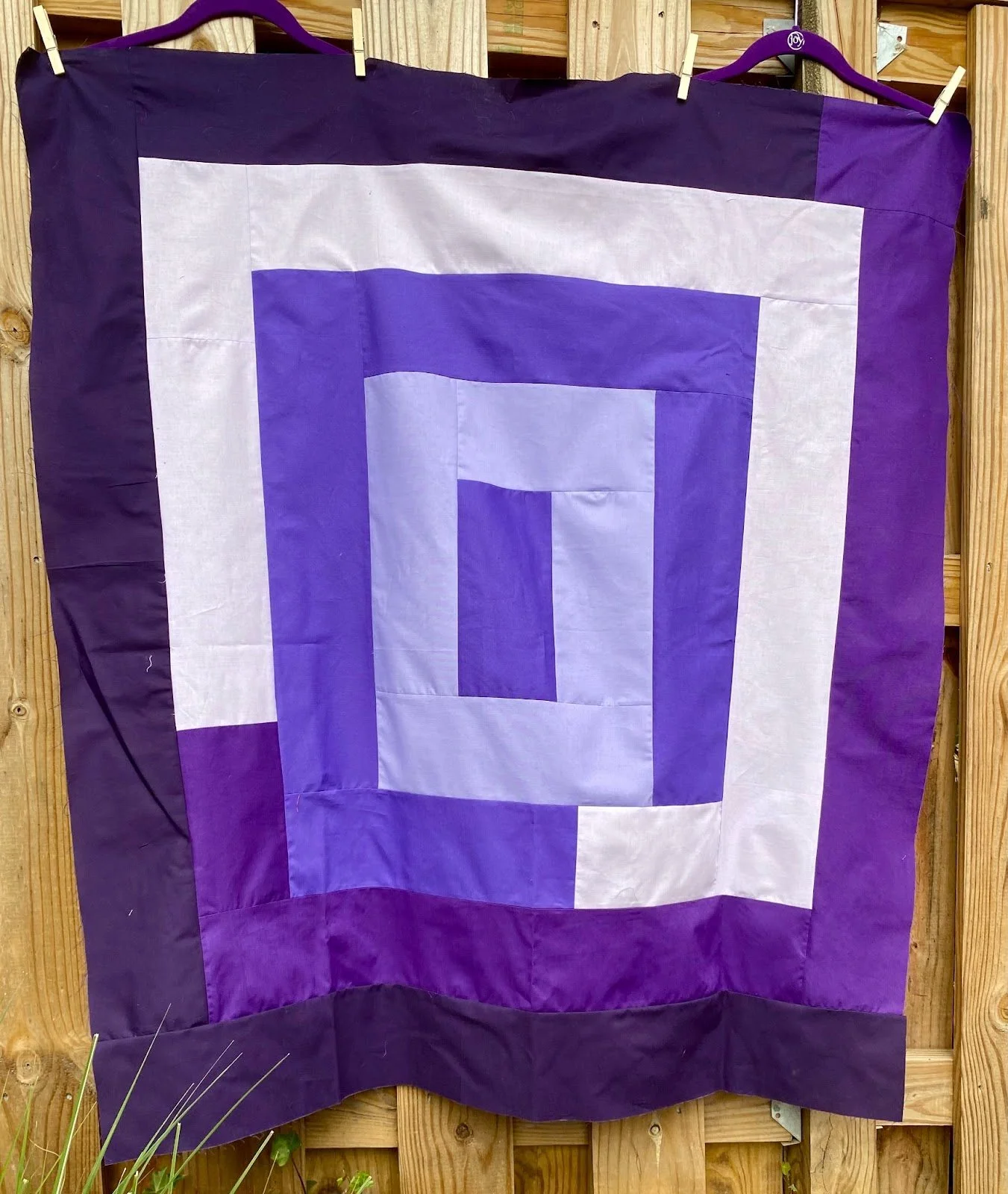
Low contrast - I love @elena_b_vs yellow monochromatic version of Carolyn Friedlander’s Ray Quilt. I think there are 4 or 5 shades of yellow. Most have very subtle changes and there’s one that much darker. I think the subtle shifts in color really engage the eye and the quilting is fabulous. I tried to copy her using my purples but tried to use it in this low contrast way and it ended up “meh.” I like how the two dark purples play off one another and the two light purples. If I do this again - and it's tempting - I would look at purples that have much less contrast and maybe one outlier to add some zing.
-

Tips on Fabric Pulls 3
High contrast - @cottonandbourbon has been having a ton of fun with high contrast, monochromatic log cabin blocks. I’m curious how a quilt made solely of log cabins in one hue would look. I’ve seen many beautiful monochromatic 2-color quilts. When you work on the challenge, you may want to check out her feed because she is listing her Kona colors for each block!
-

Tips on Fabric Pulls 4
Vary the volume and the value - When my purple quilt didn’t work out the way I had hoped, I did some rage sewing with scraps. Rage quilting is a very effective therapy and healthier than bourbon. Yes, you can mix neutrals with a hue and have a monochromatic quilt. This is my personal rule and I’m pretty sure I’ve read it in blogs and books by famous quilters. I love making these scrappy crumb blocks. The black and whites really make the purples pop.
Tips and Resources
Mixing up prints can also be very fun. I decimated my stash of red fat quarters on large throw size Carolyn Friedlander Ray quilt at the top. The only two blocks that are solids are the outer left and bottom. Most of the reds are fairly similar but the movement is created by the volume and the white. Having a little bit of dark red adds some drama. Is it truly monochromatic? Nope. I cheated. Some of those reds are orangey reds but the chickens don’t mind.
The challenge is to make a monochromatic quilt. You may choose any pattern, but I urge you to consider Carolyn Friedlander’s Ray quilt, the rectangular log cabin quilt featured in many of the quilts above. It's a free pattern available here (click on the 3rd picture on the page and you will see the menu bar at the bottom of the picture). It's a very easy pattern with minimal cutting and piecing so you’ll have time to focus on the fabric pull. A charity sized quilt easily can be made with 5-6 fat quarters or quarter yard cuts.

